Sunday, January 20, 2013

Emerald City


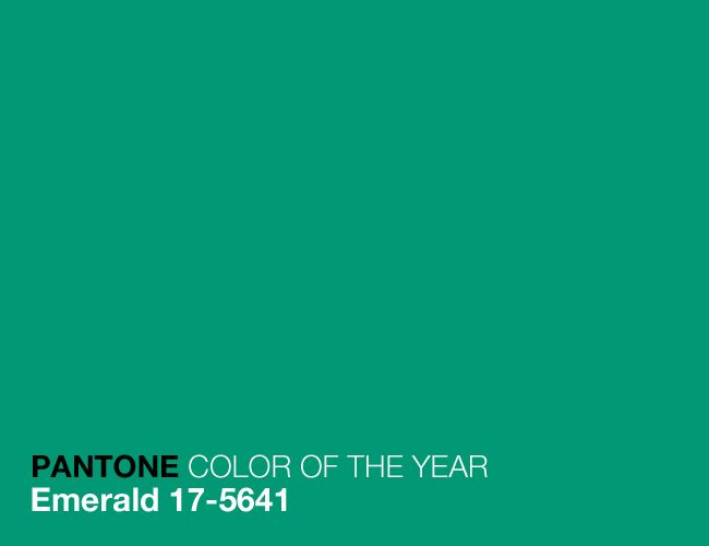
Happy New Year to all! We're back after a very busy holiday season which we hope you all enjoyed. The new year brings new beginnings, and that includes Pantone's new color of the year for 2013. After the vibrant and energetic Tangerine Tango got us fired up last year, Pantone is opting for a cooler but equally lively hue to spotlight for this year: Emerald. 

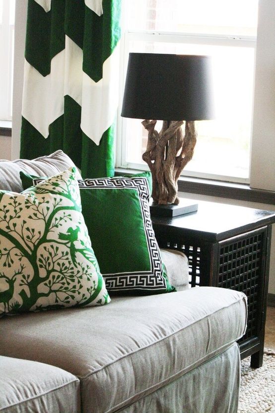
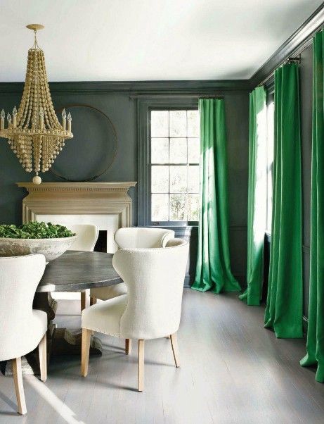
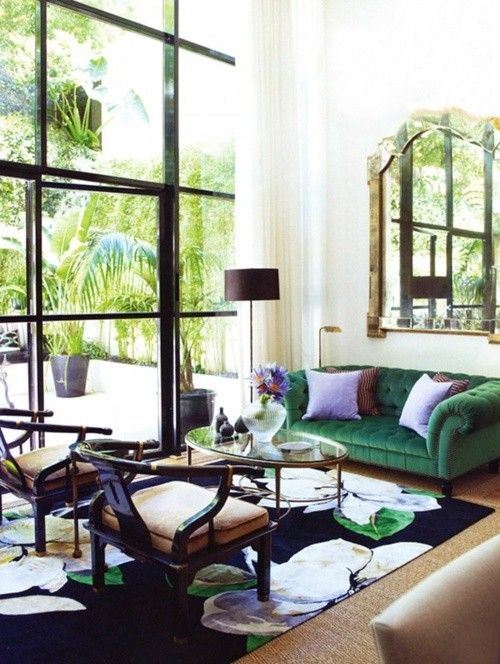
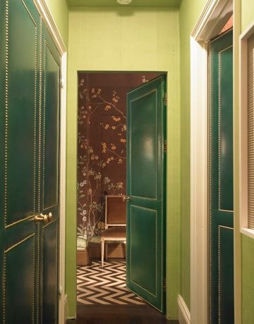
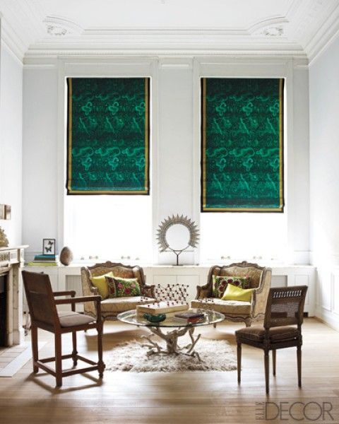
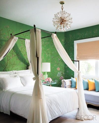
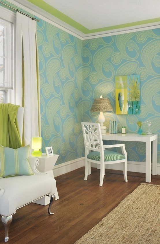
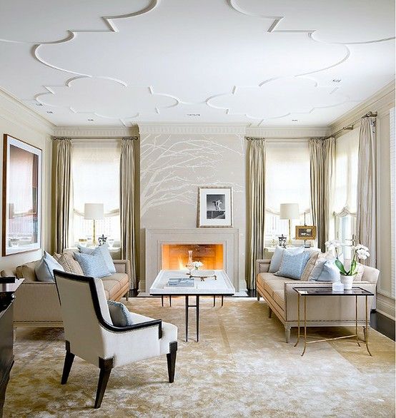
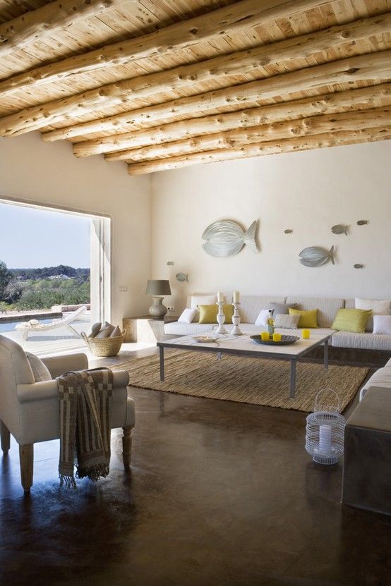
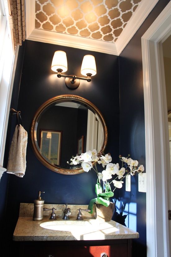
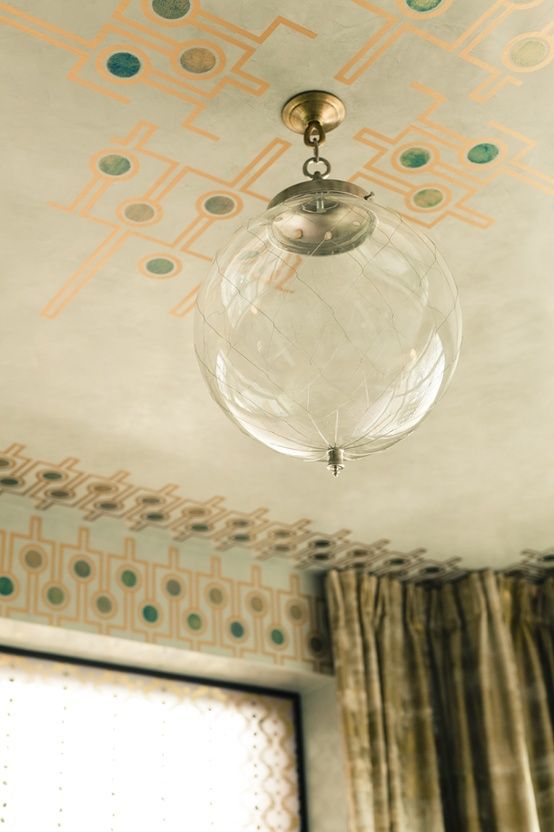
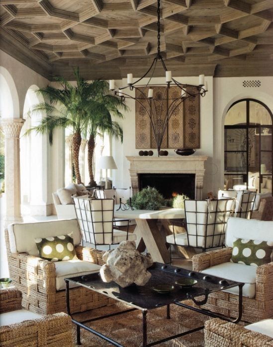
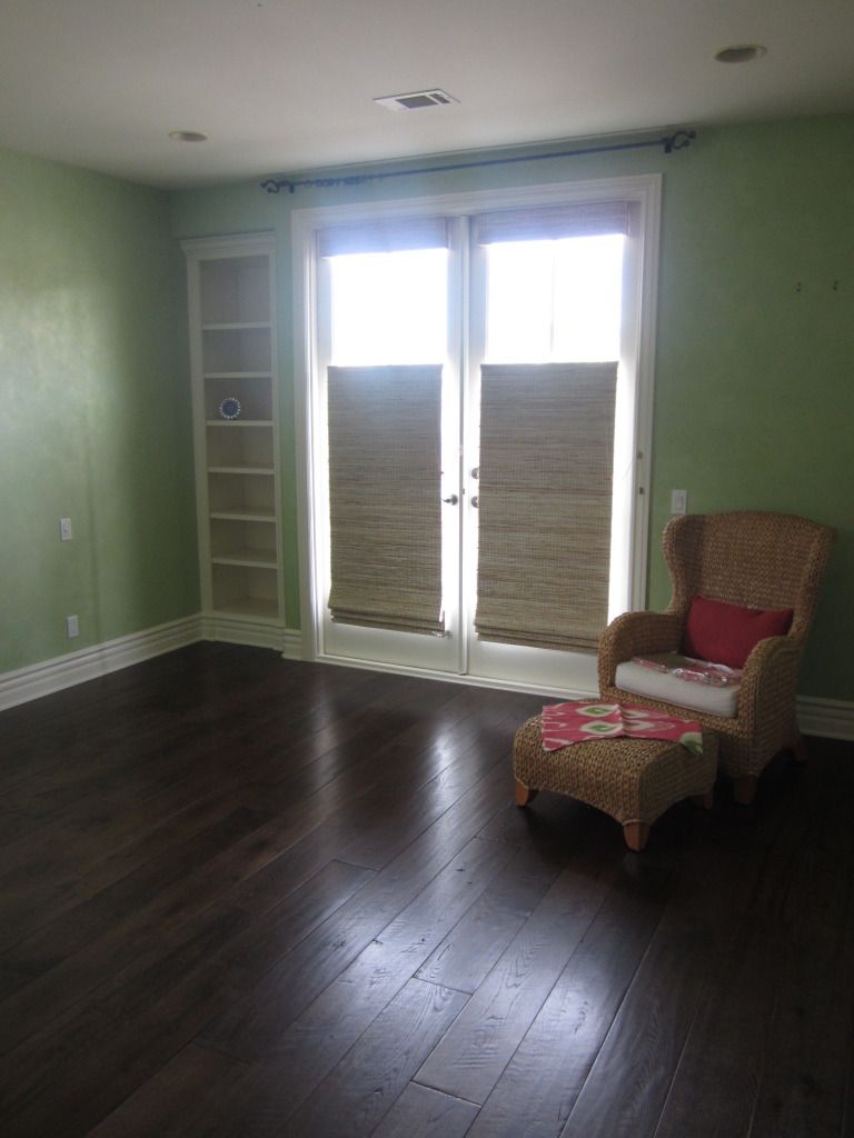
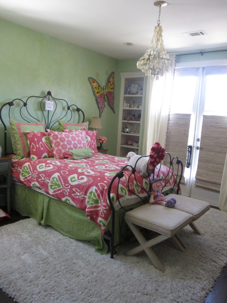
Emerald green is a rich and luscious jewel tone that conveys a sense of elegance and timeless beauty, but also reminds us of the earthy and calm tones of nature. Check out these beautifully done interiors which utilize emerald hues:  


Thursday, October 25, 2012

A Golden Moment

I always had a preference for silver accents when it came down to the question of silver or gold. From kitchen cabinet hardware to jewelry chains and ring bands and the metal letters on the car that indicate its model, I've always preferred the silver hue of nickel and chrome to the golden hue of brass. Lately, though, I've been loving the gold!

I was digging deep and asking myself the tough questions that lead to this change of heart. I thought about all of the reading I'd been doing about one of my favorite periods in art history lately: the Vienna Secession. Images of Gustav Klimt's beautiful gold leaf paintings and the white and gold contrast of Joseph Olbrich's Secession Building in Austria started popping into my head. Aha! Perhaps that's what has been influencing me. Check them out:


Gustav Klimt's Adele Block-Bauer I:


Joseph Olbrich's Secession Building and its details:


The Vienna Secession developed in the late 19th century and carried on into the early 20th century, with its active years about parallel to that of the Art Nouveau movement. It was comprised of a school of painters, craftsmen, and architects who sought to reject the pomp and formality of the flamboyant architecture and design that dominated most of the 19th century. They instead favored a return to more natural and functional forms. There was no strictly unifying "look" to this artistic movement, but rather a collective spirit to the art and designs that defined it. The movement's motto was, "To the age, its art. To art, its freedom."

Now let's look at some fun, modern day pieces with golden-hued designs that I've been loving lately! (Mind you, these are not Vienna Secession designs. They're just pretty. And golden.)  


Tuesday, October 2, 2012

Looking Up: Ceiling Designs


Oftentimes it seems that plenty of attention is given to the walls and floors of a room, but the ceiling remains a missed opportunity. The ceiling is one of the largest surface areas of a room, and can be a great place to add some beautiful details. Below are just a few examples of what can be done. Let’s take a fun little trip back into the past and take a look at some historical examples for inspiration first!


Gothic fan vault details:


Painted Italian Renaissance ceiling:


Scottish architect Robert Adams' detailed ceiling design from the 18th Century:


Art Deco stained glass ceiling in Buffalo City Hall:


Aren't those ceilings gorgeous? Now let's take a look at some examples that can be applied to a modern day home. From exposed ceiling beams to nail head trim--yes, nail head trim on the ceiling!--there are so many possibilities:


Wednesday, September 26, 2012

Sporty & Whimsical: 10th Street Kids' Rooms

In the last post we showcased the 10th Street project's elegant new beach kitchen, but this week we'll share the fun kids' room redesigns. The boys' room needed a fun new look to reflect their hobbies, so we went with a cool baseball theme and coordinating colors. Take a look!


For the girl's room, we infused some fun pink and green hues and lively patterns for a bit of whimsy:


Thanks for stopping by!

Friday, August 31, 2012

Beach Elegance: 10th Street Kitchen

Hello all! We're so excited to show you a project that is just wrapping up. Take a look at what the 10th Street kitchen used to look like: 


The finishes and color scheme were too dark and formal for this house by the beach, the original lay-out which included a small island and a bar were awkward, and overall the space just did not function as well as it could... the goal was to transform the space into something that reflected a lighter west coast beach mood and could be a full service kitchen and HQ for this busy family of 5. A look at the kitchen remodel in progress: 


Here's a sneak peek of the kitchen dining area as we wait for the dining table and settee to arrive to accompany the dining chairs and that gorgeous chandelier: 


A close up of the iridescent tile we used for the kitchen back splash:


And the house is nearly complete! Those bar stools are a temporary, but quite useful as we wait for the new ones to arrive. If you're wondering whether that's a ping pong table in the bottom right hand corner of the last photo... you're absolutely right! The wonderful family that lives here is fun-loving and while the family room is filling in, they figured why not


Linked Within

Related Posts with Thumbnails